Friday 20 April 2012


100 Ideas That Changed Graphic Design #76

Posted by Mark Sinclair, 18 April 2012, 14:41    Permalink    Comments (0)
In the first of three extracts from Steven Heller and Véronique Vienne's new book on 100 Ideas That Changed Graphic Design, we begin with idea #76: The Big Book Look...
The latest in Laurence King's '100 Ideas' visual arts series includes 100 different concepts, techniques, tools and objects that the authors believe have helped shape the medium of graphic design. We'll be running three extracts from 100 Ideas That Changed Graphic Design up on the CR blog over the coming days. Here's the first...
#76 The Big Book Look
In the mid-1950s the American designer Paul Bacon defined a literary design genre known as the ‘big book look', in which a book cover was characterised by a large title, a large author's name and a small symbolic image. The look was conceived as a matter of commercial pragmatism in 1956 when Bacon designed the dust jacket for Compulsion by Meyer Levin, a book based on the real-life story of two young men who murdered a boy to see if they could get away with it.
The publisher wanted the jacket to evoke the case without sensationalising it. Bacon sketched out a number of ideas until he came up with the notion of positioning the rough, hand-scrawled word ‘Compulsion' at the top of the jacket, taking up a fifth of the space. Under that, two tiny, nervously rendered figures running on the vacant expanse towards the title were printed in red. The art is reminiscent of Saul Bass's 1955 Expressionistic film poster and titles for The Man with the Golden Arm, but was influenced by the jazz albums Bacon had designed starting in the late 1940s. The book became a huge bestseller and the jacket caught the US publishing industry's attention. Other publishers wasted little time in contacting Bacon to design jackets for their potential bestsellers.
Bacon's jacket oeuvre embodies the history of late twentieth-century commercial book cover design – a legacy of eclectic lettering, illustration and typography before the digital revolution. Perhaps more importantly, he made books sell. Marketers liked using an icon or a logo on a jacket rather than conventional treatments of type or literal illustration. Bacon was good at, as he put it, "finding something that would be a synthesis graphically of what the story was about".
While he was no traditionalist, neither did he follow the Modernist notions of Paul Rand, Alvin Lustig and Leo Lionni, who imbued their covers with more subtlety. While Bacon admired these designers, their book covers were generally designed for works of criticism, analysis and 
literature with small print runs, enabling them to do virtually anything they wanted with little interference. Bacon's more commercial orientation required that he navigate sales and advertising requirements.

Though most of Bacon's covers were built on some conceptual idea or image, the cover for Philip Roth's Portnoy's Complaint (1969) was uncharacteristic. It was solely type against a yellow background, with no fancy touches, except for the swashes on capitals (with flowing or curlicue serifs) in the title and the author's name. Asked why he avoided his signature conceptual image, Bacon said it was because of the difficulty in portraying the book's most prominent element – masturbation.
Cover from Adrian Harrington Rare Books, not included in 100 Ideas
Ambiguity – fragmented and vague pictorial jackets with skewed type – is much more frequent in present-day book covers, which may explain why the big book look, though not precisely obsolete, is no longer a design code.
This essay is taken from 100 Ideas That Changed Graphic Design, published by Laurence King; £19.95 and available from laurenceking.com. We will be posting two more extracts from the book over the next few days.

Thursday 19 April 2012

The big yellow rabbit


Florentijn Hofman created this larger than life sculpture of a yellow bunny in orebro, sweden. the big yellow rabbit is a temporary 13 meter high sculpture. the enlarged cuddle toy is made out of swedish products thrown against the statue of engelbrekt. ON//

Wednesday 18 April 2012

Six things I know (an one I don't) by John Spencer

Six things I know (and one I don't)

John Spencer

Think inside the box
Everyone’s heard the hackneyed catchphrase ‘thinking outside the box’. It’s meant to be about thinking differently and looking beyond the obvious. Well here’s a novel idea; try thinking inside the box. You’ll be amazed by what you’ve missed. Never be afraid of the bleedin’ obvious. It surprises most of the people most of the time.

You don’t have to be ‘a creative’ to be creative
Sometimes the most unlikely people say the most unexpected things. Thomas Telford is the ‘knowledge business’ of the Institution of Civil Engineers. We were having a briefing meeting when someone said, in an off-hand kind of way, “Every civil engineer wants to build a bridge”. I borrowed that thought and built their visual identity out of it. Good ideas can come from anyone.

Hold your nerve
I always tell clients to be flexible, responsive and prepared for flack. I also tell them to trust their instinct. It’s always right. Prince Philip, Senior Fellow of The Royal Academy of Engineering, was less than enthusiastic about our rebrand. And Aston University’s students rebelled over our logo that was, they said, ‘like a bag of Doritos’. Both institutions held their nerve. Both rebrands have been a huge success.

Idiosyncratic + ruthless = unforgettable
This is my formula for an unforgettable brand. It has to be idiosyncratic; that’s to say, everything an organisation says and does and the way it looks should be so individual and characteristically ‘them’ that they just couldn’t be mistaken for any other. It’s those idiosyncrasies that need to be uncovered, given form and voice, and ruthlessly protected.

Tell them a bloody good story
“For sale: baby shoes, never worn.” In the 1930s, Ernest Hemingway’s friends bet him $10 he couldn’t write a complete story in just six words. And that was what he wrote. He later said it was the best thing he’d ever written. Brand is all about telling bloody good stories. It’s about inviting people in and making them want to know more.

We’re the blue collar workers of the art world
All too often, design companies offer charities pro-bono work or design on the cheap in exchange for creative freedom and the chance to jump on the ethical bandwagon. Creative freedom is a recipe for disaster. An open-ended brief will always end in tears because there’ll be confusion about what the work is supposed to achieve. Everything we designers do is a means to an end. Creativity without boundaries is pointless.

I have no fucking idea what the future of fucking design is*
The world now knows that there are known knowns; there are things we know we know. We also know there are known unknowns; that is to say we know there are some things we do not know. And there are also unknown unknowns – the ones we don’t know we don’t know. We know we can’t know the future, so the future of design is very definitely a known unknown. And I’m as excited by that one thing I don’t know as the six I do.

*Saul Bass (Aspen Design Conference, circa 1983)

John Spencer is creative director and co-founder of not-for-profit branding agency Spencer du Bois. He also writes and lectures on design, and works as an independent creative consultant and designer through his company, Off the Top of My Head.

Monday 16 April 2012

Eltono

Cover of Line and Surface

Line and Surface is available from Stickit, priced 24.95 Euros. More info is here. Eltono's personal website is at eltono.com, where you can also view videos of him creating his works.

Musical jellies

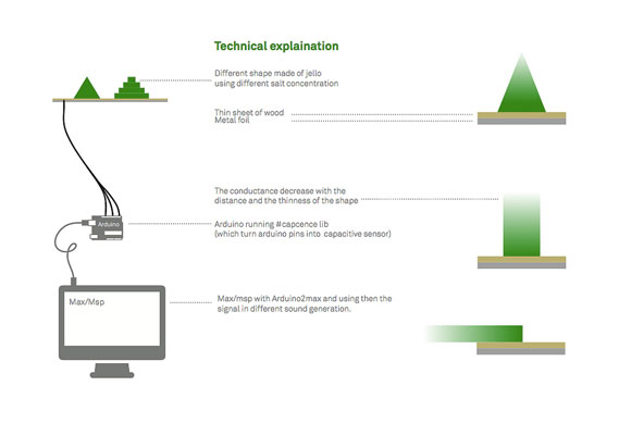
Raphaël Pluvinage and Marianne Cauvard's Noisy Jelly project is a game that allows each player to create their own musical instrument out of jelly. The video for the project uses absolutely no sound editing, and needs to be seen and heard to be believed...

Using a mini chemistry lab, each player makes their own set of jellies using water, agar agar powder and a series of molds. The jelly shapes are then placed on the game board, and can be manipulated to create sound.

If you, like us, are slightly bewildered about how all this works, there's some proper science behind it. The game board is a capacitative sensor, and the variations in the shape of the jelly and its salt concentration, as well as the distance and strength of the finger contact, all affect the final sound. The diagram below helps explain things somewhat.

Fauna Logo


Series of Font to come through1!

Sunday 1 April 2012

New Illustration Work Added


Here are some of my illustration work added on
http://ucotopia.com/illustration.html