100 Ideas That Changed Graphic Design #76
Posted by Mark Sinclair, 18 April 2012, 14:41 Permalink Comments (0)
In the first of three extracts from Steven Heller and Véronique Vienne's new book on 100 Ideas That Changed Graphic Design, we begin with idea #76: The Big Book Look...
The latest in Laurence King's '100 Ideas' visual arts series includes 100 different concepts, techniques, tools and objects that the authors believe have helped shape the medium of graphic design. We'll be running three extracts from 100 Ideas That Changed Graphic Design up on the CR blog over the coming days. Here's the first...
#76 The Big Book Look
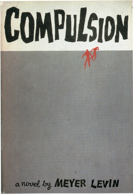
In the mid-1950s the American designer Paul Bacon defined a literary design genre known as the ‘big book look', in which a book cover was characterised by a large title, a large author's name and a small symbolic image. The look was conceived as a matter of commercial pragmatism in 1956 when Bacon designed the dust jacket for Compulsion by Meyer Levin, a book based on the real-life story of two young men who murdered a boy to see if they could get away with it.
The publisher wanted the jacket to evoke the case without sensationalising it. Bacon sketched out a number of ideas until he came up with the notion of positioning the rough, hand-scrawled word ‘Compulsion' at the top of the jacket, taking up a fifth of the space. Under that, two tiny, nervously rendered figures running on the vacant expanse towards the title were printed in red. The art is reminiscent of Saul Bass's 1955 Expressionistic film poster and titles for The Man with the Golden Arm, but was influenced by the jazz albums Bacon had designed starting in the late 1940s. The book became a huge bestseller and the jacket caught the US publishing industry's attention. Other publishers wasted little time in contacting Bacon to design jackets for their potential bestsellers.
Bacon's jacket oeuvre embodies the history of late twentieth-century commercial book cover design – a legacy of eclectic lettering, illustration and typography before the digital revolution. Perhaps more importantly, he made books sell. Marketers liked using an icon or a logo on a jacket rather than conventional treatments of type or literal illustration. Bacon was good at, as he put it, "finding something that would be a synthesis graphically of what the story was about".
While he was no traditionalist, neither did he follow the Modernist notions of Paul Rand, Alvin Lustig and Leo Lionni, who imbued their covers with more subtlety. While Bacon admired these designers, their book covers were generally designed for works of criticism, analysis and
literature with small print runs, enabling them to do virtually anything they wanted with little interference. Bacon's more commercial orientation required that he navigate sales and advertising requirements.
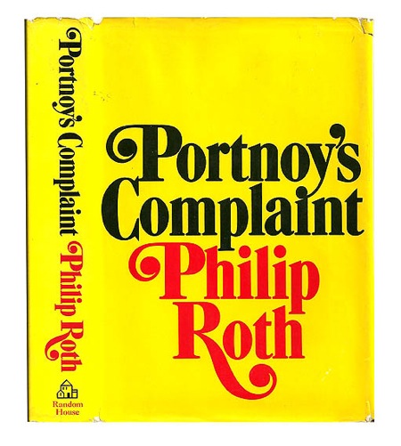
Though most of Bacon's covers were built on some conceptual idea or image, the cover for Philip Roth's Portnoy's Complaint (1969) was uncharacteristic. It was solely type against a yellow background, with no fancy touches, except for the swashes on capitals (with flowing or curlicue serifs) in the title and the author's name. Asked why he avoided his signature conceptual image, Bacon said it was because of the difficulty in portraying the book's most prominent element – masturbation.
Though most of Bacon's covers were built on some conceptual idea or image, the cover for Philip Roth's Portnoy's Complaint (1969) was uncharacteristic. It was solely type against a yellow background, with no fancy touches, except for the swashes on capitals (with flowing or curlicue serifs) in the title and the author's name. Asked why he avoided his signature conceptual image, Bacon said it was because of the difficulty in portraying the book's most prominent element – masturbation.
Cover from Adrian Harrington Rare Books, not included in 100 Ideas
Ambiguity – fragmented and vague pictorial jackets with skewed type – is much more frequent in present-day book covers, which may explain why the big book look, though not precisely obsolete, is no longer a design code.
This essay is taken from 100 Ideas That Changed Graphic Design, published by Laurence King; £19.95 and available from laurenceking.com. We will be posting two more extracts from the book over the next few days.
No comments:
Post a Comment